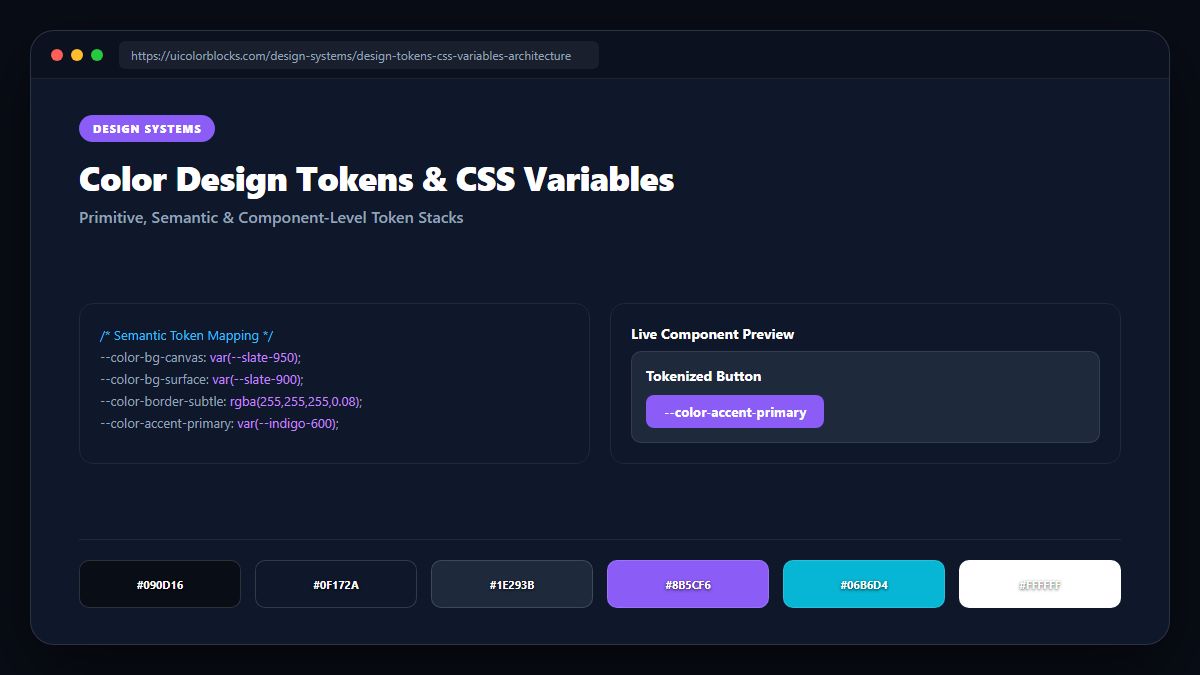
1. The Three Tiers of Design Tokens Explained
Primitive tokens hold raw values (e.g. --blue-500: #3b82f6). Developers should almost never reference primitives directly in components. Instead, primitive tokens feed Semantic tokens (--color-action-primary: var(--blue-500)), which then feed Component tokens (--btn-primary-bg: var(--color-action-primary)).
/* Tier 1: Primitive Values */
:root {
  --color-blue-500: #3b82f6;
  --color-blue-600: #2563eb;
  --color-slate-900: #0f172a;
}

/* Tier 2: Semantic Intent */
[data-theme="light"] {
  --surface-primary: #ffffff;
  --text-primary: var(--color-slate-900);
  --interactive-default: var(--color-blue-500);
}
[data-theme="dark"] {
  --surface-primary: var(--color-slate-900);
  --text-primary: #f8fafc;
  --interactive-default: var(--color-blue-600);
}

/* Tier 3: Component Binding */
.button-primary {
  background: var(--interactive-default);
  color: #ffffff;
}
2. Painless Dark Mode Swapping with Semantic Aliases
With a proper semantic token layer, switching to dark mode requires exactly zero changes to your component stylesheets. You simply update the semantic CSS variables under the [data-theme="dark"] selector.
| Semantic Token | Light Mode Value | Dark Mode Value | Component Consumer |
|---|---|---|---|
| --surface-base | #ffffff | #0f172a | body, main viewports |
| --surface-elevated | #f8fafc | #1e293b | .card, .modal, .dropdown |
| --border-subtle | rgba(0,0,0,0.08) | rgba(255,255,255,0.08) | divider rules, card borders |
3. Naming Conventions: BEM vs. CTI Structure
Follow the Category-Type-Item (CTI) naming syntax: color-surface-card, color-text-muted, color-border-focus. This prevents naming confusion between engineering and product teams.
4. Summary Best Practices for Design Token Systems
Keep token hierarchies lean: aim for 15-20 semantic tokens rather than 200 micro-tokens. Export instant CSS variable sets directly from our Palette Studio.
5. Implementation Blueprint & Token Architecture
Translating theoretical color principles into production code requires consistent design token binding. When engineers hardcode ad-hoc hexadecimal values directly inside component CSS classes, theme parity breaks down and maintaining accessibility becomes an ongoing liability. By adopting disciplined semantic variables, your frontend application can swap themes, adapt to high-contrast operating system preferences, and enforce strict accessibility thresholds across every viewport.
When architecting your color tokens, establish an invariant rule: UI components must consume semantic tokens rather than raw primitives. This abstraction layer ensures that updating your brand identity or adjusting dark mode surface elevations requires changing values in a single centralized design token stylesheet rather than executing search-and-replace across thousands of individual CSS or JSX files.
/* Centralized Design Token Integration Blueprint */
:root {
  --color-canvas-base: #f8fafc;
  --color-surface-card: #ffffff;
  --color-border-subtle: rgba(0, 0, 0, 0.08);
  --color-text-primary: #0f172a;
  --color-text-muted: #64748b;
  --color-interactive-primary: var(--brand-500);
  --color-interactive-hover: var(--brand-600);
}

[data-theme="dark"] {
  --color-canvas-base: #080810;
  --color-surface-card: #16162a;
  --color-border-subtle: rgba(255, 255, 255, 0.08);
  --color-text-primary: #f0f0fa;
  --color-text-muted: #a0a0c0;
  --color-interactive-primary: var(--brand-400);
  --color-interactive-hover: var(--brand-500);
}
For frontend engineering teams using modern utility-first CSS frameworks like Tailwind CSS, export your verified semantic tokens directly into your tailwind.config.js file. This creates autocompleted utility classes such as bg-surface-card and text-interactive-primary, ensuring developers build accessible, harmonious interfaces without leaving their editor.
Put These Tokens into Practice
Explore our interactive design tools to test contrast ratios, generate 50–950 shade steps, or discover harmonious color palettes.