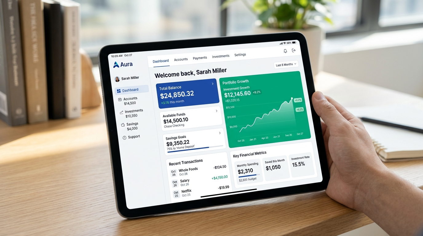
1. Why Deep Navy and Cobalt Blue Dominate Financial Systems
Historically and psychologically, deep blues (#0f172a, #1e3a8a, #0284c7) symbolize reliability, institutional endurance, and security. Unlike energetic warm hues, blue slows heart rates and inspires cognitive calm. In modern fintech interfaces, navy is frequently combined with crisp white cards and metallic accents to project both technical modernity and vault-like security.
/* Enterprise Fintech Security Tokens */
:root {
  --fin-canvas: #0b1329;       /* Deep vault navy */
  --fin-card: #131f3d;         /* Elevated transaction card */
  --fin-primary: #0284c7;      /* Stable brand cyan/blue */
  --fin-gain: #10b981;         /* Positive portfolio return */
  --fin-loss: #f43f5e;         /* Negative draw down */
  --fin-border: rgba(2, 132, 199, 0.18);
}
2. The Gain/Loss Duality: Managing Market Volatility
In western stock trading apps, green indicates positive gains while red indicates market losses. However, in East Asian financial markets (including mainland China, Taiwan, and Japan), red represents price increases and prosperity, while green represents price declines. Modern global fintech platforms must design dynamic token sets that adapt based on the user’s regional locale.
| Locale | Gain Color (Bullish) | Loss Color (Bearish) | Neutral Index State |
|---|---|---|---|
| Western (US / EU) | Emerald Green (#10b981) | Rose Red (#f43f5e) | Slate Gray (#64748b) |
| East Asian (CN / JP) | Imperial Red (#ef4444) | Jade Green (#10b981) | Muted Charcoal (#71717a) |
| Accessibility Safe | Cyan (#06b6d4) | Amber (#f59e0b) | Muted Slate (#94a3b8) |
3. Data Density and Low-Latency Readability
High-frequency traders process thousands of price updates per minute. Rapid color flashing (green to red) can cause severe visual fatigue. Leading trading terminals dim background cards to low-luminance slates and limit color changes to brief border pulses or small font indicators.
4. Practical Implementation Rules for Financial Apps
Use high-contrast monospaced numerals for account balances. Ensure alert banners do not trigger panic, and check all token pairings in our 100k Colors Matrix to guarantee optimal hue separation.
5. Implementation Blueprint & Token Architecture
Translating theoretical color principles into production code requires consistent design token binding. When engineers hardcode ad-hoc hexadecimal values directly inside component CSS classes, theme parity breaks down and maintaining accessibility becomes an ongoing liability. By adopting disciplined semantic variables, your frontend application can swap themes, adapt to high-contrast operating system preferences, and enforce strict accessibility thresholds across every viewport.
When architecting your color tokens, establish an invariant rule: UI components must consume semantic tokens rather than raw primitives. This abstraction layer ensures that updating your brand identity or adjusting dark mode surface elevations requires changing values in a single centralized design token stylesheet rather than executing search-and-replace across thousands of individual CSS or JSX files.
/* Centralized Design Token Integration Blueprint */
:root {
  --color-canvas-base: #f8fafc;
  --color-surface-card: #ffffff;
  --color-border-subtle: rgba(0, 0, 0, 0.08);
  --color-text-primary: #0f172a;
  --color-text-muted: #64748b;
  --color-interactive-primary: var(--brand-500);
  --color-interactive-hover: var(--brand-600);
}

[data-theme="dark"] {
  --color-canvas-base: #080810;
  --color-surface-card: #16162a;
  --color-border-subtle: rgba(255, 255, 255, 0.08);
  --color-text-primary: #f0f0fa;
  --color-text-muted: #a0a0c0;
  --color-interactive-primary: var(--brand-400);
  --color-interactive-hover: var(--brand-500);
}
For frontend engineering teams using modern utility-first CSS frameworks like Tailwind CSS, export your verified semantic tokens directly into your tailwind.config.js file. This creates autocompleted utility classes such as bg-surface-card and text-interactive-primary, ensuring developers build accessible, harmonious interfaces without leaving their editor.
Put These Tokens into Practice
Explore our interactive design tools to test contrast ratios, generate 50–950 shade steps, or discover harmonious color palettes.