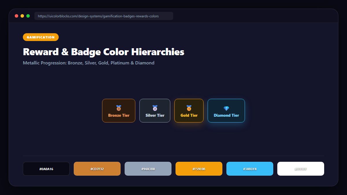
1. The Universal Metallic Progression: Bronze, Silver, Gold, Platinum
Across cultures, human beings intuitively understand metallic tier progressions. A successful gamification architecture establishes a clear chromatic hierarchy: earthy Bronze for beginners, clean Silver for intermediates, radiant Gold for masters, and luminous Diamond/Platinum for elite performers.
/* Gamification Metallic Tier Tokens */
:root {
  --tier-bronze:   #cd7f32;   /* Warm copper bronze */
  --tier-silver:   #94a3b8;   /* Cool refined silver */
  --tier-gold:     #f59e0b;   /* Radiant warm gold */
  --tier-platinum: #06b6d4;   /* Electric cyan platinum */
  --tier-diamond:  #a855f7;   /* Rare amethyst diamond */
  --tier-master:   #ef4444;   /* Legendary ruby red */
}
2. Avoiding Color Inflation in Reward Systems
A common design flaw in reward systems is handing out bright gold badges for trivial onboarding actions (like verifying an email). When gold is everywhere, it loses all psychological value. Early milestones should use cool silvers and soft indigos, reserving gold strictly for true achievements.
| Achievement Tier | Base Color | Gradient Glow Effect | Milestone Example |
|---|---|---|---|
| Bronze (Novice) | #cd7f32 | None (Solid Flat) | First profile completed |
| Silver (Adept) | #94a3b8 | Subtle 0 4px 12px shadow | 7-day login streak |
| Gold (Veteran) | #f59e0b | Linear metallic highlight | 100 tasks completed |
| Diamond (Elite) | #a855f7 | Radial pulse animated glow | Top 1% global contributor |
3. Streak Badges and Urgent Retention Reminders
Daily streak counters (like Duolingo’s flame) utilize high-chroma orange and fire red (#f97316 to #ef4444). The energetic warmth creates an emotional trigger that prompts users to complete daily lessons before midnight.
4. Summary Best Practices for Gamified Interfaces
Keep tier colors consistent across all modals, profile avatars, and leaderboards. Test your metallic gradient scales in our Curated Palettes library.
5. Implementation Blueprint & Token Architecture
Translating theoretical color principles into production code requires consistent design token binding. When engineers hardcode ad-hoc hexadecimal values directly inside component CSS classes, theme parity breaks down and maintaining accessibility becomes an ongoing liability. By adopting disciplined semantic variables, your frontend application can swap themes, adapt to high-contrast operating system preferences, and enforce strict accessibility thresholds across every viewport.
When architecting your color tokens, establish an invariant rule: UI components must consume semantic tokens rather than raw primitives. This abstraction layer ensures that updating your brand identity or adjusting dark mode surface elevations requires changing values in a single centralized design token stylesheet rather than executing search-and-replace across thousands of individual CSS or JSX files.
/* Centralized Design Token Integration Blueprint */
:root {
  --color-canvas-base: #f8fafc;
  --color-surface-card: #ffffff;
  --color-border-subtle: rgba(0, 0, 0, 0.08);
  --color-text-primary: #0f172a;
  --color-text-muted: #64748b;
  --color-interactive-primary: var(--brand-500);
  --color-interactive-hover: var(--brand-600);
}

[data-theme="dark"] {
  --color-canvas-base: #080810;
  --color-surface-card: #16162a;
  --color-border-subtle: rgba(255, 255, 255, 0.08);
  --color-text-primary: #f0f0fa;
  --color-text-muted: #a0a0c0;
  --color-interactive-primary: var(--brand-400);
  --color-interactive-hover: var(--brand-500);
}
For frontend engineering teams using modern utility-first CSS frameworks like Tailwind CSS, export your verified semantic tokens directly into your tailwind.config.js file. This creates autocompleted utility classes such as bg-surface-card and text-interactive-primary, ensuring developers build accessible, harmonious interfaces without leaving their editor.
Put These Tokens into Practice
Explore our interactive design tools to test contrast ratios, generate 50–950 shade steps, or discover harmonious color palettes.